Ads from Creative Marketing Concepts (CMC) never lacked the thrills of whimsy and color. See work pre-new look. Successful as whimsy was, owner Zachary Tyler, had a new vision. Kramer stepped in to redirect the creative strategy.
CMC is your go-to for all things swag. They excel in rapid-fire turnaround and have a reliable network of vendors that meet strict quality standards. Where the previous brand focused more on customization: every color, every product for your every need—Zachary made a strategic decision to shift the company’s focus to quality instead of quantity. He set out to redefine expectations for promotional products.
CMC is on Market Street in San Francisco—prime real-estate full of businesses competing for interest. The new brand would be more focused, buttoned-down and mature. This identity shift makes it clear to the passersby that this business means business, they take themselves seriously and will interact with savvy insightful professionalism.
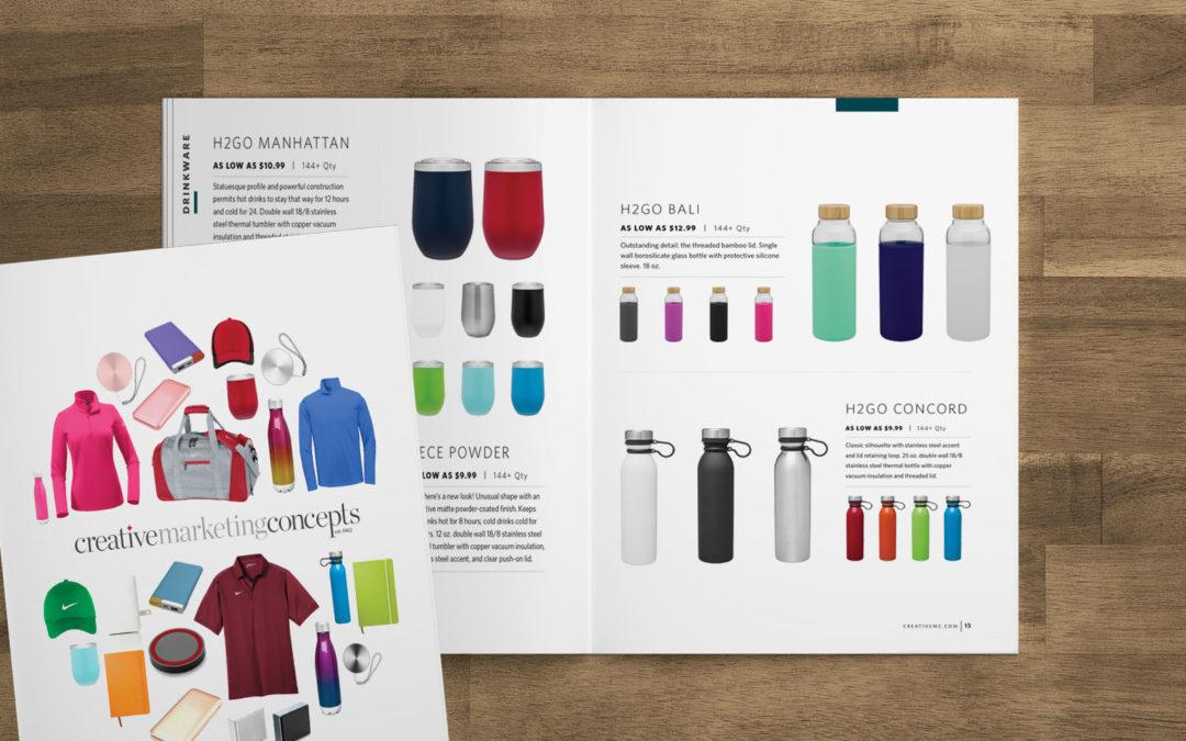
Instead of presenting all products in all varieties, CMC leads by example. The best products with the best graphics lead customers to order, I’ll have what they’re having.
Kramer presented a variety of concepts to fit the new bill and landed on this beauty featuring Hoefler’s Chronicle and Whitney font families. Chronicle, a nineteenth century Scotch face, belongs engraved on a diamond, inside a Cadillac or mingling about a supermodel. Reaching higher in quality is arguably insurmountable.
![]()
A 45+ page Brand Style Guide followed the logo. All the usual suspects were represented along with a few additions: an extensive tagline usage section, promotional placement demonstrations and a logo placement scheme adaptable to any product’s form.
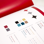
Linen stock, metallics, oversized envelopes, aluminum and a few other sassy finishing touches added welcome accessories to the brand narrative. Custom color mixes called “Platinum,” “Rolls Royce” and “Red Velvet” ascended this look into a dream-like nirvana. Okay, close at least.
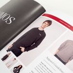
Stark minimalism requires extra attention to type styling, hierarchy and bountiful masses of intentional white space. To add interest and customization to the elite look, we added a welcome companion—high texture, hip-subject, editorial-style, toned photography. That’s a lot of hyphens. Images are carefully chosen to meet certain criteria, the primary criteria being the ‘I want to be that San Francisco hip guy/gal’ feeling.
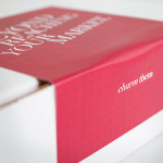
When type is the lead roll, copy makes or breaks a piece. Headlines like “Go beyond reaching your market—charm them” and “Nice Mug” bought class and culture full-circle.
Brand style guide and logo complete, we’re off to the races with campaigns. I’m bringing my red branded sunglasses, glass canteen and golf towel. I’ll let you know if the favorite wins.